Brand & identity direction
The ACNL brand system
A documented brand — colors, logo rules, voice, and channel guidelines — built so a statewide association run largely by volunteers could look like itself without a designer in the room.
The problem
When I started, ACNL's visual identity was basically clip art and flyers made in Microsoft Word. There was no documented brand, no agreed colors, no logo rules, no standard templates, no guidance at all for the board members, committee chairs, and chapter leaders who were each producing their own materials.
Between all of the chapters, committees, and task forces, ACNL has probably about a hundred volunteers producing some type of content, whether that be PowerPoint presentations for webinars and chapter meetings or text and graphics for social media posts. These volunteers are all high-level experts in their field, but their field is nursing, not graphic design. So my goal was to create guidelines to create a recognizable, professional look that one person could maintain on a daily cadence, and that a roomful of volunteers could follow without creating brand risk.
The guidelines live on the ACNL website as a set of reference pages for partners and volunteers. What follows is that system, rebuilt here in my own site rather than shown as screenshots.
The colors
ACNL has two main brand colors. Apricot is the traditional color of the nursing graduation stole and evokes warmth, creativity, and comfort. Indigo evokes integrity, trust, and reliability: in a word, leadership. Each color has recommended accessibility-safe text pairings, because the people using them aren't designers and shouldn't have to guess.
The logo
One primary lockup — the California silhouette in the apricot stripe, wordmark alongside — plus a small kit of sanctioned alternates for the layouts where the primary won't fit.
-0c64a181-1920w.webp)
And two monochrome treatments for when color isn't available or the logo has to sit on a busy background.
Rules that keep it consistent
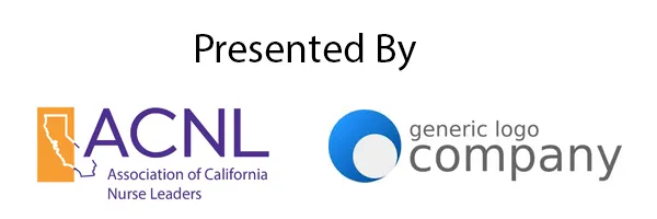
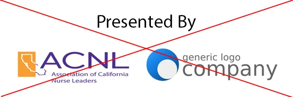
When someone sent me a flyer or PowerPoint to edit, one of the most common things I found myself correcting was a stretched logo, or one dropped into a busy part of the screen. So the guidelines are built as plain do / don't pairs anyone can eyeball before they hit publish.

-1920w.webp)
Guidelines for every channel
The hardest part of keeping a brand consistent while acting as the only marketing person isn't making the graphics yourself. It's helping everyone else develop theirs. Chapters and committees often produce their own flyers and posts, so I wrote channel guidelines that tell them what actually works where, and why.
Email blasts stay text-first
Our members read email on hospital networks behind aggressive firewalls that block images, and many rely on screen readers. So event details never live inside a graphic — an image-only flyer becomes an unreadable blank. Send me the information, not just the flyer, and I convert it to plain text.
Social respects the crop
A print flyer is built at 8.5×11. Instagram wants something close to 4:5, so a flyer dropped in as-is gets its head and feet cut off. Design for the platform, not around it.
-1920w.webp)
+copy-1920w.webp)
One message per graphic
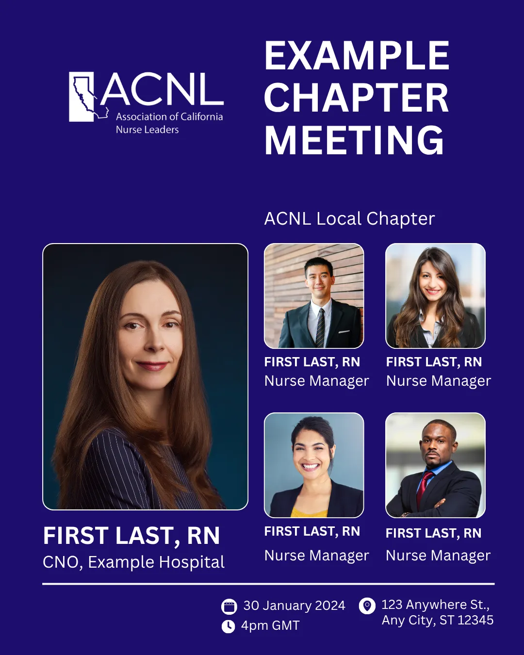
Most social gets read on a phone. Cram in four speakers with headshots, titles, a date, a time, and an address and every element shrinks past legibility. Pick the one thing the post is for.
-1920w.webp)
Print has its own math
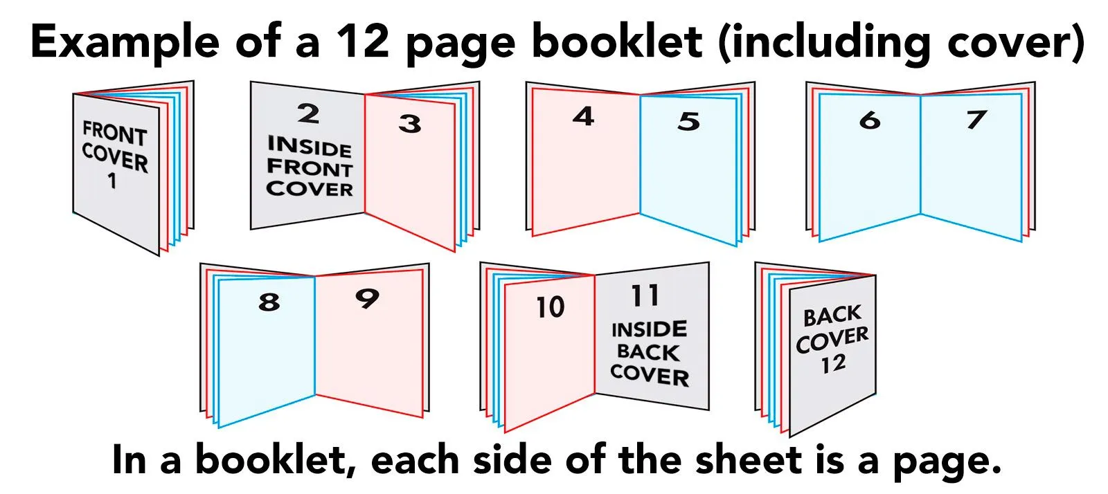
Print is where deadlines are immovable and mistakes can't be cheaply fixed, so the guidelines get specific — down to how a booklet paginates, since page count has to land in multiples of four and each side of a sheet is its own page.
The voice
A brand is how it sounds, not just how it looks. Two of ACNL's core values are diversity and inclusivity, and the voice guidelines make that concrete: the audience runs from bedside nurses to legislators to the general public, so word choice stays simple, jargon and acronyms get spelled out on first use, and the tone reads like a person talking, not an institution performing seriousness.
The other two values are integrity and innovation. Integrity sets a respectful, trustworthy floor — these are leaders, and the writing has to earn that. Innovation is the permission to have fun: it's what got us onto Instagram and into podcasting, reaching new audiences in more casual formats without ever sounding off-brand.