2026 Annual Conference
Turn Up the Volume on Nursing Leadership
The most stressful theme in seven years: a music concept the committee loved but couldn't visualize, a frustrated designer threatening to quit, and the sketch that saved it.
The Westin Rancho Mirage Golf Resort & Spa · February 8–11, 2026
The setup
This was the most stressful Annual Conference theme to work on in my seven years at ACNL.
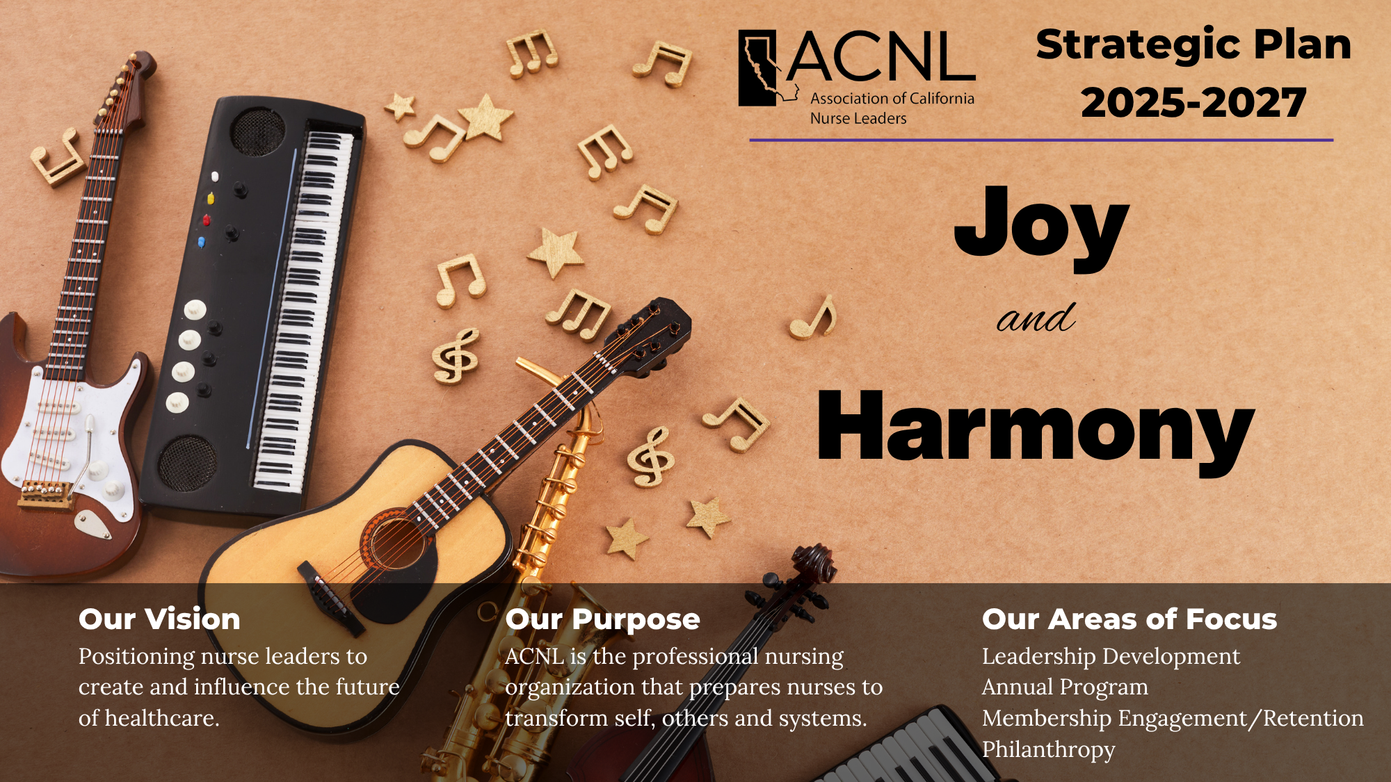
I thought it would be fun. The incoming president’s theme was “Joy & Harmony”, and she’d given out little harmonica necklaces at her inauguration, so I wanted to lean into that and do something music-related.
The pitch
I pitched the idea to the planning committee, and they liked it, ultimately deciding on “Turn Up the Volume on Nursing Leadership”. For the visual concept, I was thinking something like a poster for a musical and styling the awards brochure like a Playbill. I talked it over with our designer, who argued that the interior of a Playbill is basically just a lot of text without any real design happening, so we shifted the idea to be more evocative of vintage concert posters and liner notes.
The first round
He came up with four samples, I told him the committee was not going to like them, he insisted I present them anyway, and, predictably, the committee did not like them.
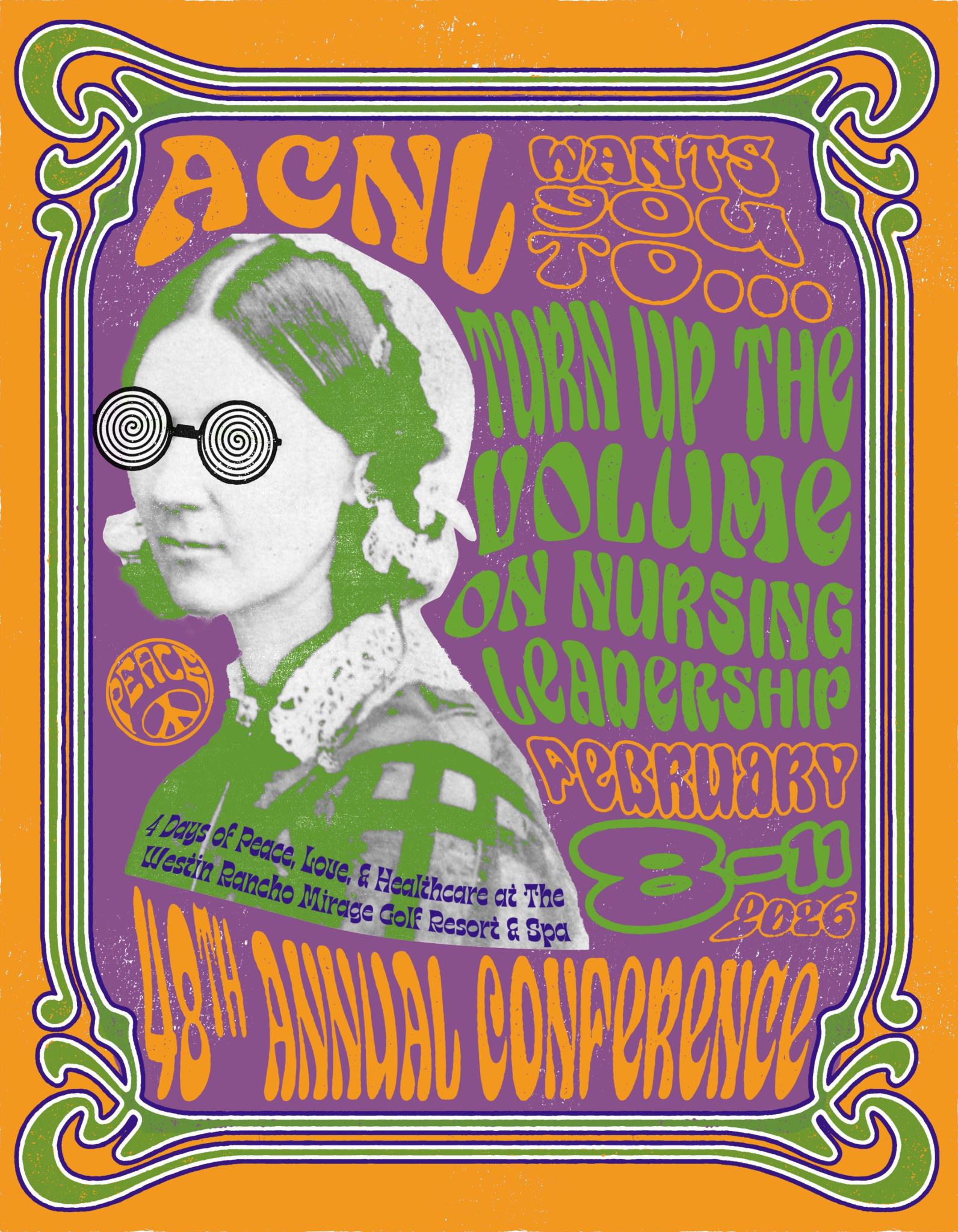
Unfortunately, like probably most design clients, they couldn’t express what it was they didn’t like, or what they wanted instead. I tried to coax better feedback out of them. I drafted intake interview questions: “What mood do you want the art to convey?” “What goals do you want the art to accomplish?” “How do you want attendees to feel when they see it?” “What words do you think of when you think of the tagline?” From a committee of about 16 people, I got responses from two or three, and they were in the vein of “you should use this or that color or font”.
Meanwhile, our designer was getting increasingly frustrated. He’d spent a lot of time on the four samples, and they were great examples of his creativity and talent.
The escalation
In the middle of all of this, I got married and went on my honeymoon, a Mediterranean cruise. I had barely any contact with the world back home for two weeks, but one morning the ship got close enough to land for me to pick up some cell signal and receive a series of messages from the designer. The committee had gone over my head while I was gone and tried to work with him directly, to disastrous results. He was threatening to quit if I didn’t step in. I spent about an hour talking him down and convinced him to wait until I got back.
The concept
When I got back, we agreed that I would produce a concept sketch before he would do any additional work, and I would get the committee to fully approve it and he would work off of it to create a final version.
I still didn’t know what the committee wanted, but I had some guesses as to what they didn’t like about the original samples. They were very creative, but the text was hard to read and the colors a bit jarring and off brand. It needed to be cleaner, simpler, and bring in more of our brand’s purple and orange.
I thought about musical aesthetics I was familiar with, like 90s grunge or modern-retro vaporwave.
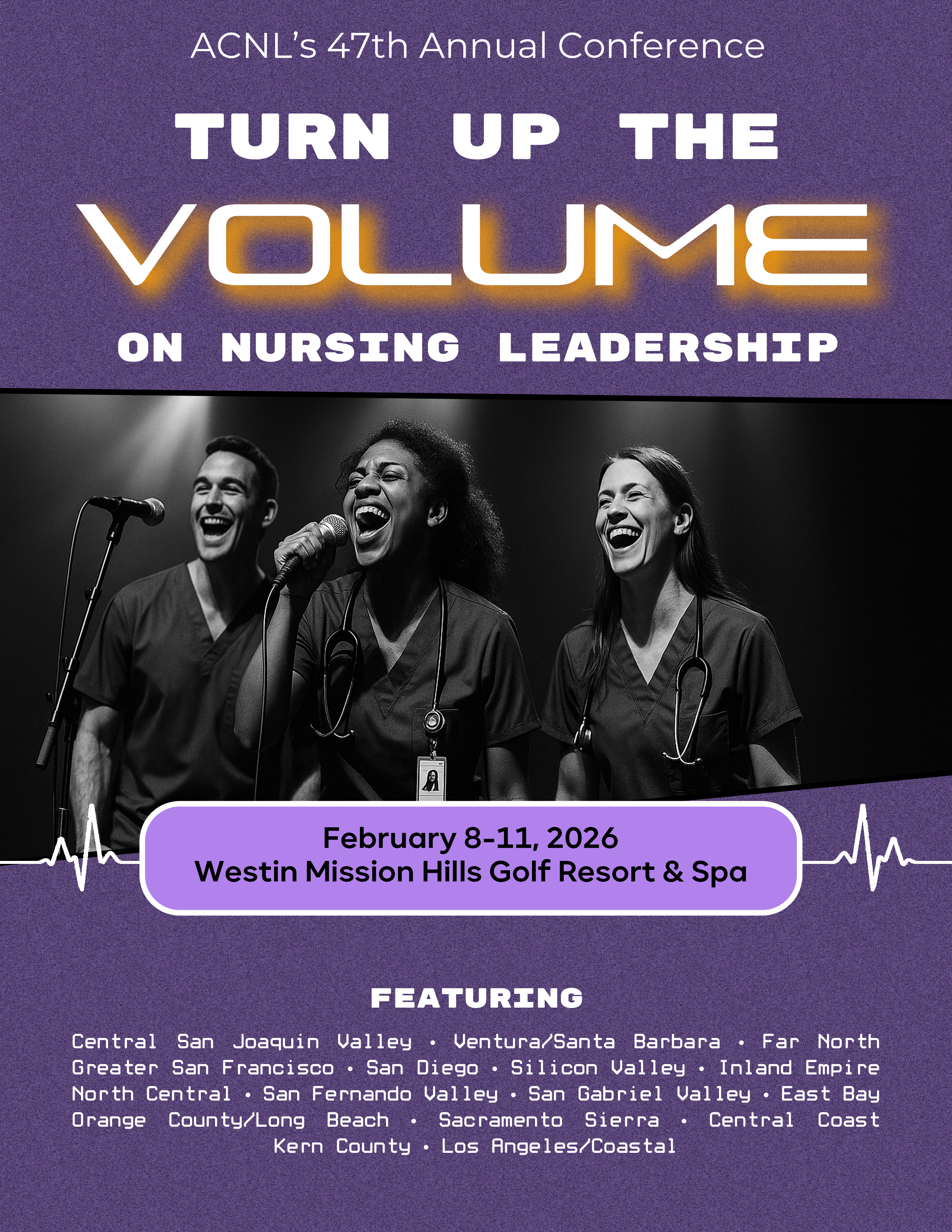
I settled on an 80s synthwave style, using ACNL’s chapters like the featured bands at a music festival.
The final version
The committee approved, so I sent it to the designer to do his magic.
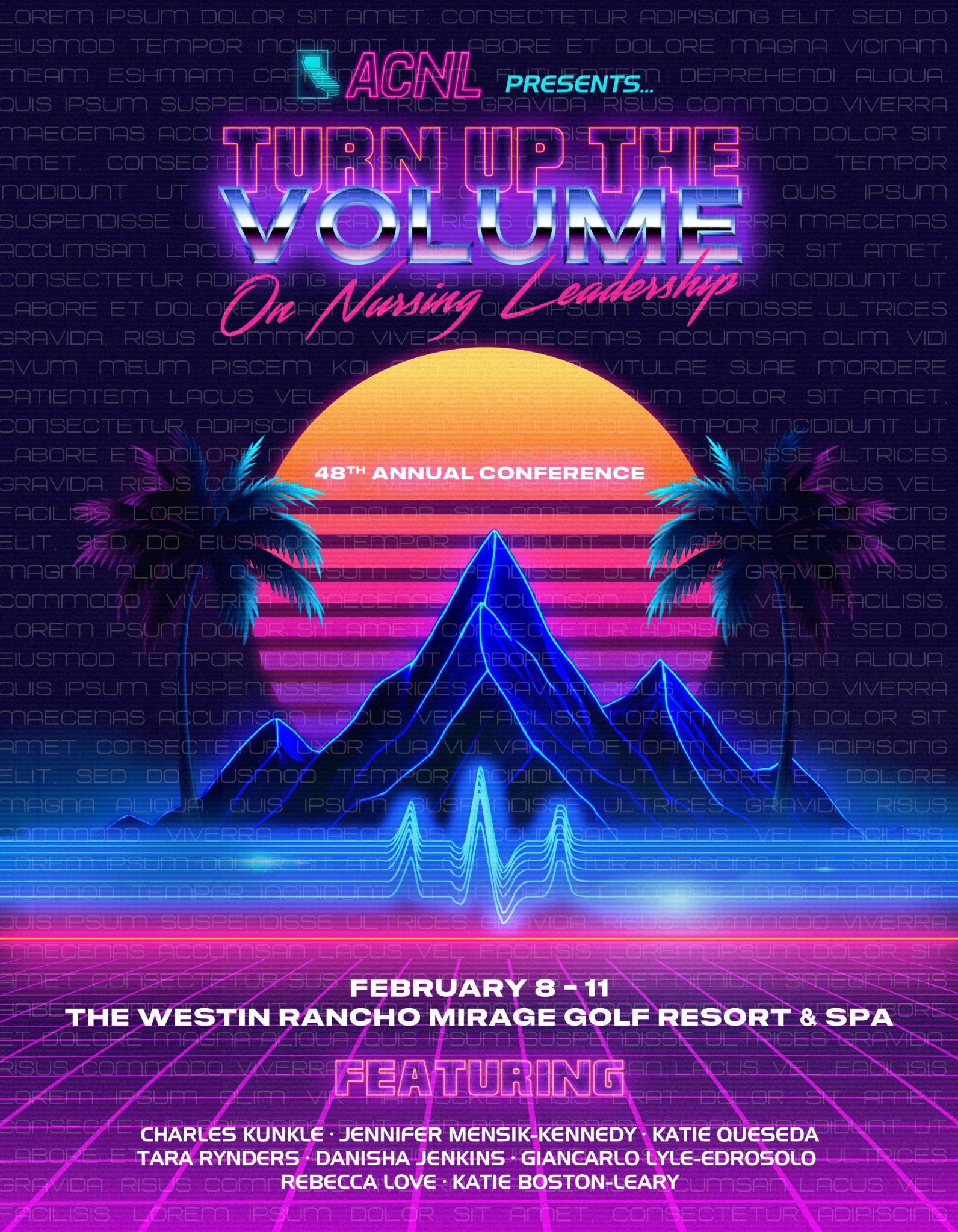
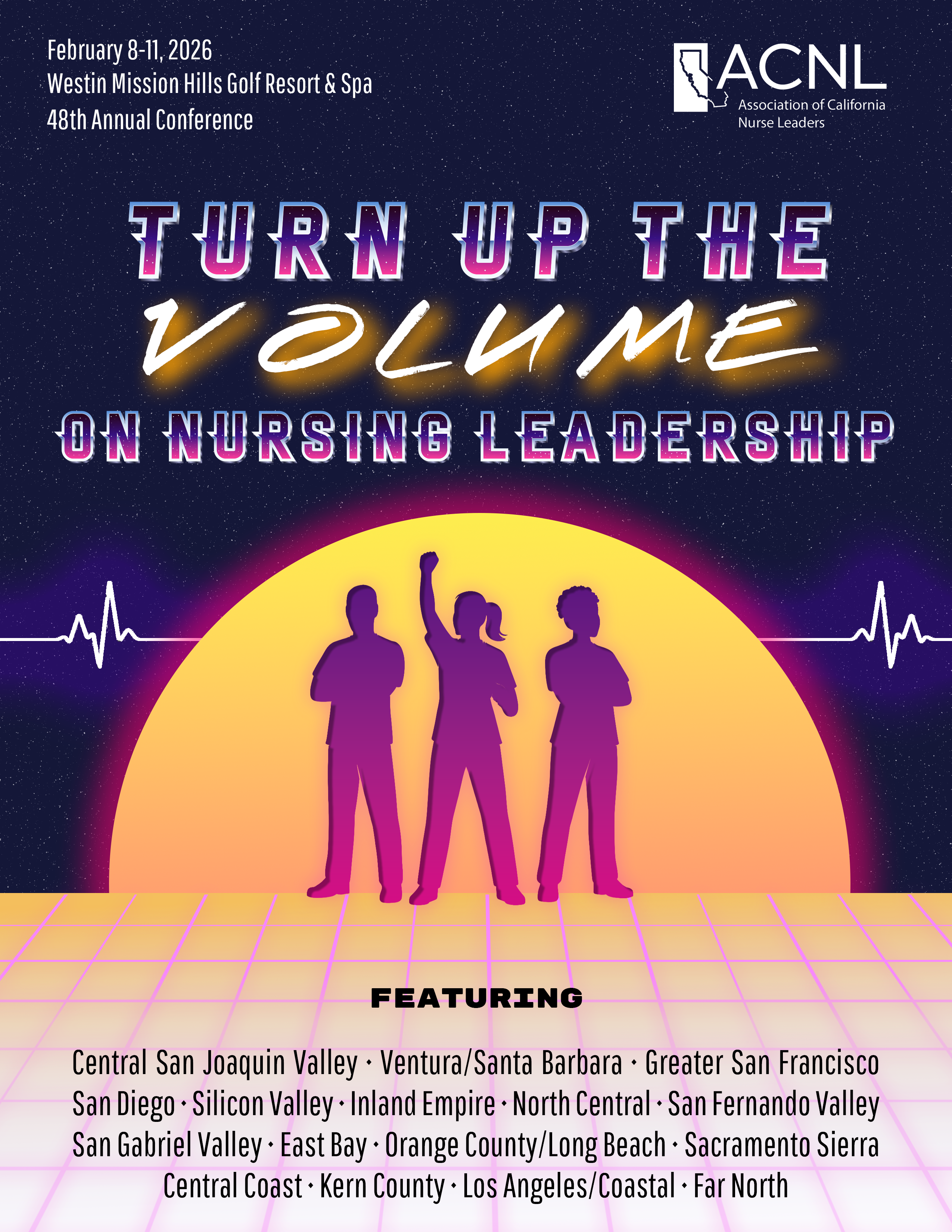
I asked him to find a new font for “On Nursing Leadership”, because I found it to be just a little too thin and hard to read, and a committee member asked us to fix the EKG rhythm, which apparently looked like someone having a medical emergency. Here’s the final version:
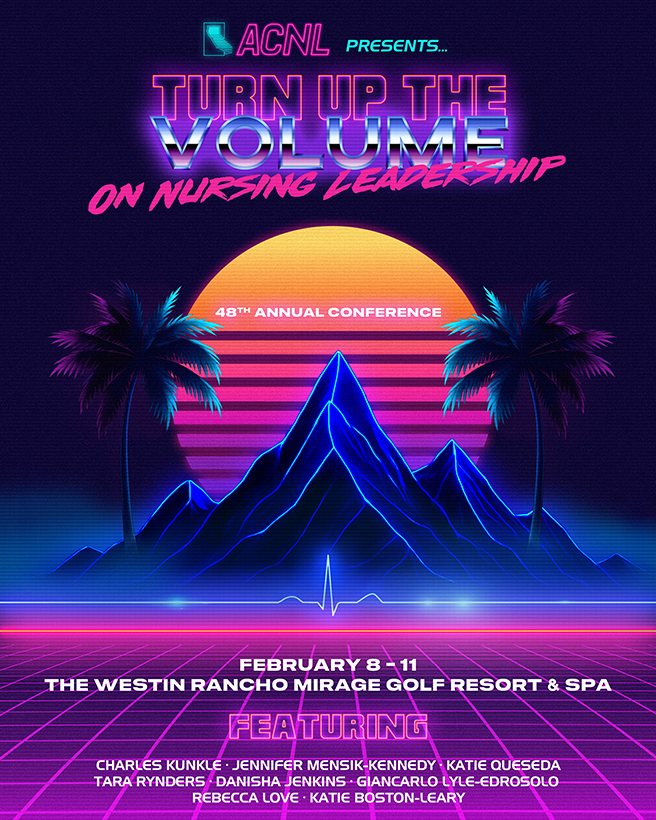
The rollout
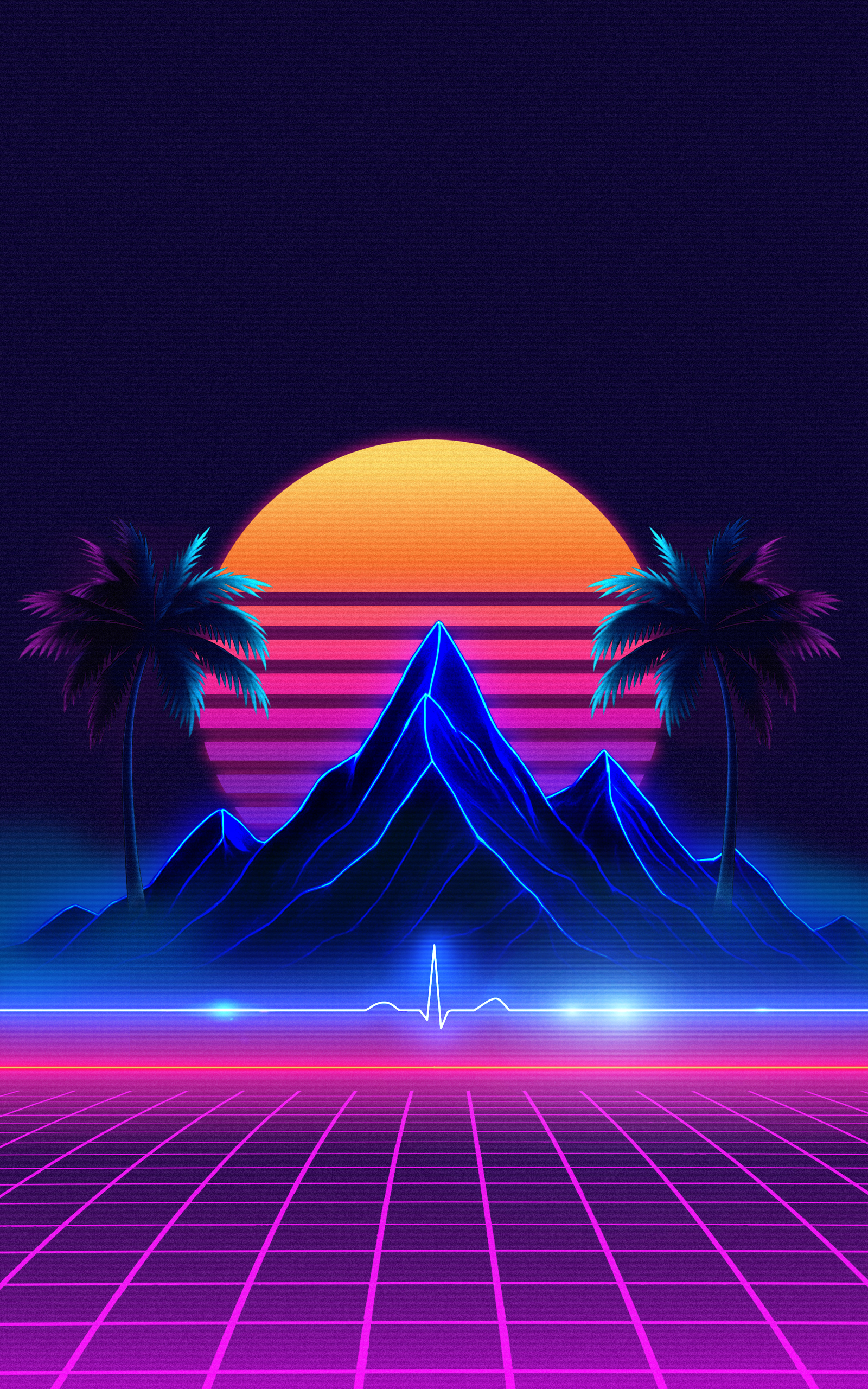
I worked with our partners at Cvent to get the app specs and sent them to the designer. We also had a photobooth this year so we needed a 2x2 photo frame.
The awards brochure
The awards brochure ended up being a crowd favorite, with a lot of people coming up to me at the conference to tell us it was the best yet.
Turn Up the Volume — Awards Program Brochure